The designs of consoles has varied much over the years, from
old cartridge playing consoles to disc playing ones. Generally they have always
been quite large machines, though not the size of a desktop tower.
I think the design of the first Playstation console was very
nice and intuitive. Almost symmetrical, it had the disc placement on the middle
of the top of the console, it wasn’t bulky either. Then the four slots in the
front, two for memory cards and two for controllers, again these were pretty
symmetrical and placed in the best possible way. You had the on and off button
placed to the left of the lid, which was a big round button with a small light
leading from it, this was again similar to the button placement on the opposite
side which controlled the lid for inserting and removing games. And there was
also a smaller reset button, handy for all those demo discs that required a
reset one you were done playing each game.
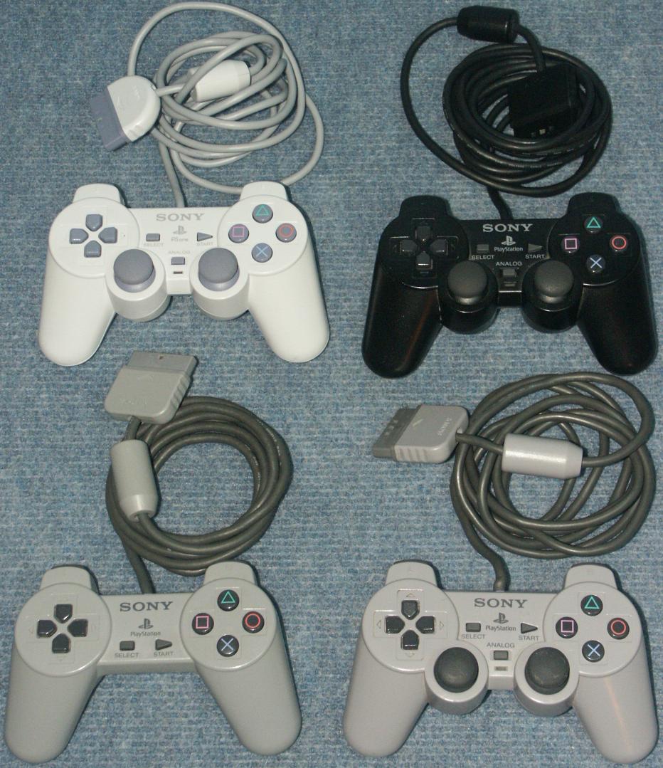
Sony’s PS controller was also a wonder. Originally with
fourteen buttons, it was a sleek design and a big leap from the Sega Genesis
controller. It had the directional buttons on the left side, and the now famous
X, square, triangle and circle buttons on the right side. Also four buttons on
the back of the controller; L1, L2, R1 and R2. There was also Start and Select
in the middle of the controller. It fit well in your hands, all the buttons
were easy to reach, and it was very light. But a little later, another controller
was brought out and this had 2 analog sticks, which many games used from that
point on. A lot of people preferred to control the game with these sticks
rather than using the D-pad. It also allowed 2 extra key presses which were L3
and R3. The controller design was such a big success that they didn’t change it
at all for their next console, the Playstation 2.
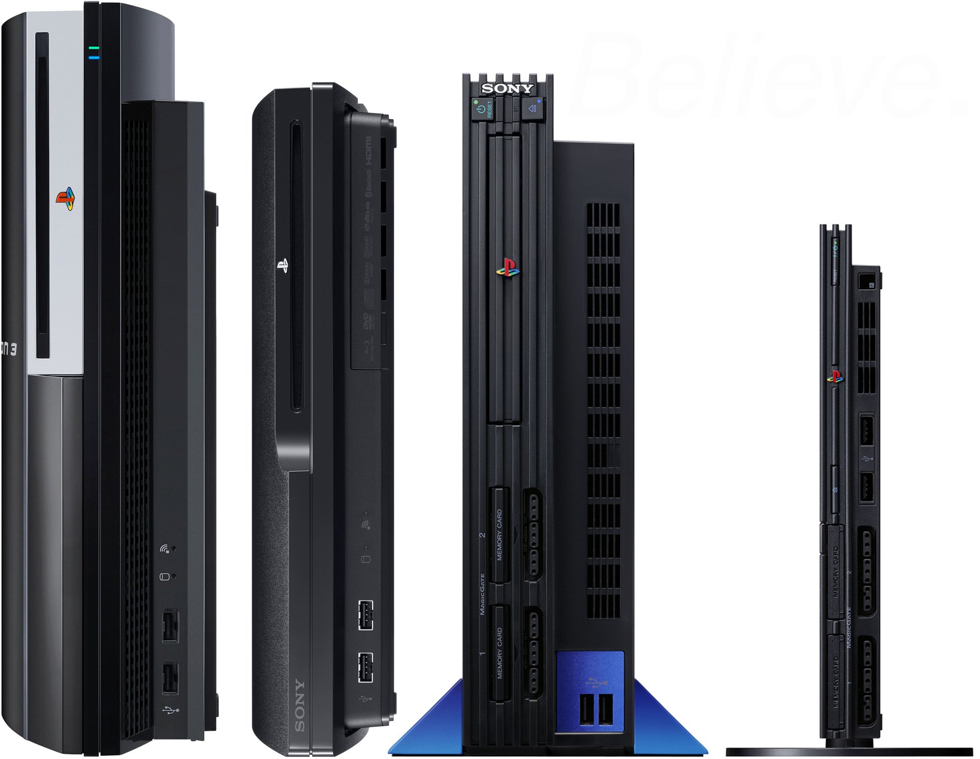
Moving on to the PS2, this was a much larger console
compared to the PS1, but it made up for its size, not only in the power and the
new games it could play, but with its ability to be placed on its side, and
there fore stand horizontally. It was down to preference which was you kept it,
and it could save space depending on where you placed it. It had a slide out
tray for the games, some small buttons placed nicely at the front for reset,
power and tray control. It had the same placement for memory cards and
controllers as the PS1. Its overall shape was basically rectangular. Much
later, there was a slim version brought out, and this was much smaller than the
PS1, which was quite surprising, and yet it run all the games perfectly. And it
was literally a miniature version of the first PS2. I would also like to
mention about the game boxes for the PS2 games, most of them had a memory card
holder placed above the disc’s space, which was very handy, providing you had
the right sort of memory card to fit in the holder!
The amount of buttons on the Sony controllers was definitely
needed, since as games advanced, more and more button were needed. Games began
to get more complicated and realistic, so user input had to be more diverse.
More and more games required multiple presses to perform different actions
within the game. This is the same for today’s consoles.
The PS3 kept the same controller design, but with wireless
options and a tilt sensor. The console itself however was a giant of a thing!
Bigger even than the original PS2, it was accepted that its size was needed
because of its vast processing power. But again, Sony brought out a slimmer
version of their new console.
On Microsoft’s Xbox 360, the console is again rather large,
but I think we are used to it at this stage! The controller is similar to the
PS controllers already discussed, except where the shape buttons on the PS
controls are, they are named A,B,X and Y. And the back buttons are called RB,
LB (bumpers), RT, LT (Triggers). I had always wondered at the placement of the
analog sticks though. The left stick is much higher, and the D-pad has replaced
where it would have been on the PS controller, next to the right stick. While
you can still access it easier, it seems that they only did this to avoid
similarity to Sony’s placement of the sticks.
Overall I think the controllers are very intuitive. For
games like Call of Duty and Gears of War, they work very well. Developers
always have a way of linking controls and making it easy to play games. And
most games copy each other. Using the same buttons for the same actions, only
to make it easier for people to get into playing a new game. I remember trying
to get my grandmother to play Driver 2 on the PS1, she complained that she
wouldn’t be able to use the controller while looking only at the screen, and I
said that you just have to get used to it, and she almost got it before she
lost interest! But it shows that games and controllers are designed in such a
way as that you don’t have to look at the controller at all once you know what
buttons to press for certain actions. Plus, games always have a tutorial or
beginner level to teach you the controls you’ll be using.
With the Nintendo Wii, PS Move and Kinect for Xbox, games
can now be played with more physical interactions than just your thumbs. Wii
was great for all the family to join in and have fun with the silly sports
games, but even the respectable fitness games allowed adults who would
otherwise never play games to give it a go. The same goes for Move and Kinect.
The effect that these motion controls have had on games has been quite
dramatic. Obviously most of them had to have specific games made just for them,
but there are also a few games that have the option of controller or motion
controls. Move and Wii is great for sword fighting games, since you feel more
like you are in the game when you are actually slashing your arms and
controlling the sword on screen. Also, since there is limited amount of actions
you can perform and stances, games that are motion controlled have been made a
lot simpler. They are quite intuitive, with actions that you perform being
obvious choices for actions in the game.


No comments:
Post a Comment