Search This Blog

Wednesday, 4 May 2011

Year 2 Group Presentations:

I really enjoyed the 2nd year group presentations. I wanted to see what the finished levels were going to be like. Especially since I have been here I kept seeing little parts of the projects every now and then whenever the second years were working in the labs at the same time as us.  I had seen several assets they were going to be using, and I saw a some people from the groups play through their levels briefly.
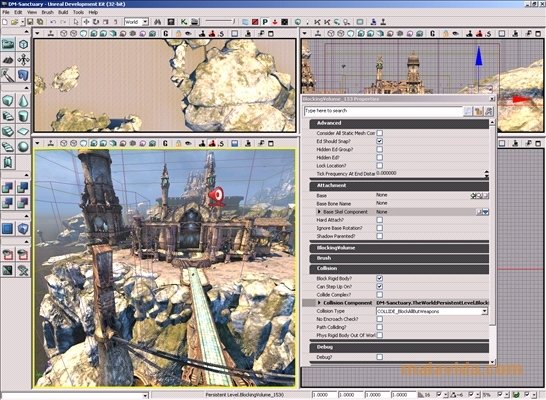
I also wanted to get a feel for what we will be doing in the next year.  I am really looking forward to the group project.  We were given some advice from the second years, and one of the best ones were that we should start learning UDK right now. One group said that they decided to book a room in the library and figure out how to use UDK all together. The program does look quite complicated. And I remember when Mark, when he was our guru, was showing us some basics of UDK, he seemed to go through it extremely fast, and I was very lost from the start!
One thing that I thought was quite interesting from one of the levels I saw was the use of particles. They had turned their version of the Queens building into a science lab where test subjects were kept. In one room, there was all this radioactive kind of dust floating around.  I moved very slowly and glowed bright blue, and it looked fantastic in the darkened room.
I thought that all of the projects had the Queens Building uniquely represented. I thought it was interested how they modified the building to suit their levels’ design. The train animation I saw in one group was really awesome. And they told explained to us why they used a lot of influences from Half Life 2. And it was because Michael had seen their level and told them it was boring! Which was funny.  I could see how the teams had all worked together to make assets and light the level in interesting ways. Each group was very unique in their designs, and they all took different approaches to the project. Some spent a lot of time concepting, and others wanted to get straight into making the level basics.
One thing I learned from one group was that they had difficulties because they didn’t have a leader. What they found was that because there wasn’t one person in charge in particular, they all seemed to do things in their own time and not particularly organised or scheduled.  So basically they said that it would be better to have a leader. But on the contrary, another group said they worked fine without a leader and preferred it that way.
When it gets to the group project, I hope that everyone gets along. I saw a couple of arguments and noticed a bit of tension between a few people. Obviously there had been a few fall outs and disagreements, but this is something kind of expected within a group project. There will be differences in opinions, but hopefully things like that can be resolved quickly enough.
Overall, I was really glad I went to the presentations; it really helped me to get some idea of what’s coming up in the second year. And it also was very entertaining and educational!

Films: Sky Blue and Scott Pilgrim vs. the World

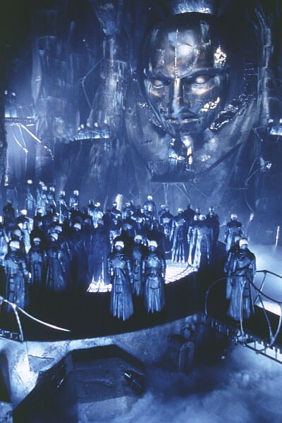
I had never heard of the film Sky Blue. It’s an anime film, set in a post apocalyptic style future. I thought it had some really interesting ideas and some pretty nice art styles. I liked the design of the giant protective city the higher class lived in, also the flying vehicles they used within the city. Although the film was quite slow at first, and we all had hysterics at the randomness of the final scene, I still thought it was a pretty good film. I think it had some nice art direction; there were some very interesting characters, and the lighting and colours in different areas, for example within the technological areas and the skies were quite beautiful. The story was ok, but maybe not very well thought out, particularly the end. It was as if they had quickly thrown in every possible event all together to try and make it more dramatic. And yet they forgot to give more detail on why starting this machine would just randomly fix the whole world in seconds.

I had seen plenty of trailers for Scott Pilgrim, but had never seen it before. I really liked the film; I thought it was funny and creative. It was cool having a comic book style in certain scenes, like with the writing and exclamations. Also the fight scenes were pretty dramatic and definitely game like. The main character wasn’t what I would typically think of as a hero, but by the end of the film, he definitely was. They made the scenes so that he was put through trials to prove himself. When I had first heard about the film, I didn’t think I would like it much and now I’ve seen it, it wasn’t what I was expecting. I would definitely watch the film again.

Elements of game design: Environment

The environments in games are one of the main key elements, it is the world you see and play through, and they have great impact on the gameplay. Not only should the environment be affecting the atmosphere of the game, but it also plays a big part in the gameplay itself. For instance, a large open world which you can explore freely will be the right sort of environment for an RPG or a sandbox style game. On the other hand, a realistic FPS game will have closed in environments, with buildings and streets where you can hide and take cover etc.
Generally, in levels, the designers construct them to lead you through the level. They are built in ways that perhaps are realistic and recognisable, so that you would know where to go, or at least be able to figure out where to go. They have to be built and decorated in some form of logical way, so that you can understand the environment and be able to travel through it and explore.
For the player to believe in the game world, I think there should be a balance between realism and stylisation. Obviously, for the game to be unique and for the world to be unique, it will have to be stylised in some way. But for it to be believable, some realistic qualities will be needed as well.
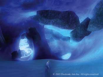
Some games can feel very enclosing. I remember playing SSX3, a snowboarding game. It had really cool and beautiful mountain environments, which you could explore to some extent. And that is where the problem was, I always used to end up going out of bounds, which causes you to reset. I always hated that, thinking that there could be so much more to explore in that direction, yet you have to stick to a certain line down the mountain. Sure, there were shortcuts, and some levels were pretty open, but it never takes long to get to the edge of play. And I think this greatly diminished the freedom aspect of the gameplay. Of course, in races, there has to be limits, but when playing on FREERIDE, you should have more to explore. Even sometimes you can be playing, and right in the middle of a trick, and without knowing that you are anywhere near the boundary, you suddenly respawn.
The environments in Dead Space were very cleverly designed to affect the gameplay experience. There were many people involved in the making of the environment, so I will just list some of the main roles. Yang Cai, Ernesto Guaman, Jian Fie Wang are all environment artists. Jonathan Hackett and Chi Wai Lao were the senior environment artists and Thomas Holt was the environment art lead. Being a futuristic survival horror kind of game, the corridors of the ship were dark and confined. It makes it seem very claustrophobic. The lights in some areas would suddenly turn off, leaving you in darkness for a moment, causing you to head towards any light. But it was not the same confined corridors all the time. There were some contrasting open areas, which were a welcome experience, such as the zero gravity zones and also times when you are out in space itself. This helped to define how big the ship really is, while also making you feel as though you will get lost. I think the designers got a lot of their inspirations from classic sci-fi horror films like Alien, and the sequels. Especially with the way futuristic ships are portrayed. Also, I would imagine that they looked at current space facilities and ships, like at NASA to get their ideas for specific things like control rooms, pipes and tech that is in corridors etc.

Tuesday, 3 May 2011

Films: “The Thing” and “Blade Runner”


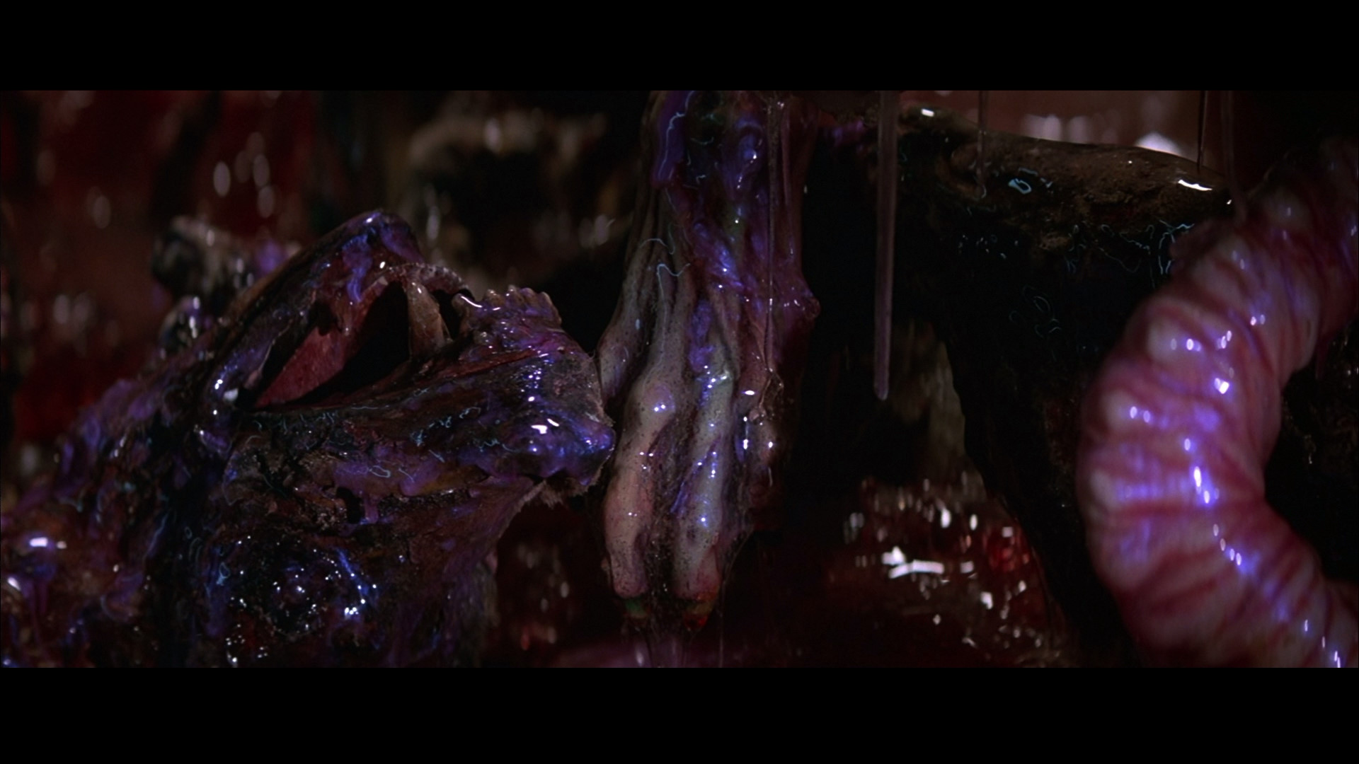
These two films are ones I had seen when I was a lot younger. But I don’t think I saw them all the way through before though. The Thing is a really good classic horror film by John Carpenter. It scared the hell out of me the first time I saw it! I absolutely hate the dog scene. But after seeing it again, I can appreciate the skills of the artists and modellers in making the creature effects. There were a few scenes where we laughed our heads off, but definitely can’t deny that it’s a good film! I heard that there is going to be a remake of the film, but the monsters will be done in CGI. Somehow I think that will lose its effect. You can beat the originals anyway, or at least rarely do you see that. Creature effects done with modelling and suits etc are really quite awesome. I’ve seen the making-of videos for films like Underworld and The Cave. In Underworld, they hand made all the werewolf suits, and the fur on them was individually poked into the latex skin! And in The Cave, the creatures were totally unique, with great details in the features and skin tones.

Blade Runner was also one I had watched when I was small, but never all the way through. I had never seen the ending, so it was good to finally see it. I thought that this film had a very interesting portrayal of the future. It was more of a dystopian future, with crowded busy and run down streets. You get the feeling that it’s an unsafe urban environment, and likely with a corrupt government. The story was quite interesting. The idea of robots walking among us has been used a lot of times, but it was interesting how the robots had some form of feelings, and wanted to protect themselves. I thought it was a very good idea to have the film based on a person who hunts down these robots. The city itself, with its huge futuristic buildings was quite amazing and unique. Films like The Fifth Element had similar buildings, and perhaps they took their inspiration from this older film.

Monday, 2 May 2011

Personal Review of the first year!

 
I’m really happy with my progress so far. The first year has been great, I’ve learnt a lot and it has been brilliant in opening my eyes to what the game industry is really like. I remember at the start of the year when we were thrown right into 3dsMax! I thought this was a great approach and I think giving us a modelling task, the Dalek, to do pretty soon was a good way to get us into learning the program. I knew we were going to be using it a lot and so I wanted to have a good look at it and get the feel for model making. Obviously at first I was a bit daunted, but I was willing to learn and quickly got the hang of the basic tools. Looking back, I can remember when I struggled with setting up reference images! By now, its second nature!

I can remember the first day we went out drawing down at the canal. I thought that was a pretty great start to Visual Design. Learning about perspective viewpoints and vanishing points is a really important part for pretty much all drawing. Also, I was glad that one point perspective was first, because it had been a while since I had done it and I really needed to practice it again. Throughout the visual design module, I could see the gradual improvements in my drawings. When I see the start of my first sketch book to the end, I am really happy with the improvements and what I learnt and developed the first year. I also really enjoyed it when we went out into Leicester to draw somewhere. I thought that it was a good part of the course, because it got us outside, and also a lot of people would assume that a game art course would involve just computers, so it was nice to draw things from actually being their in life. The trip to Bradgate Park was one of the highlights for me. I really loved the area and there was so much to draw! One of the reasons I liked it was that it reminded me of Scotland, where I had lived for 3 years. The terrain was similar to the highlands. It’s definitely a good part of the course, and I guess the only thing I would have liked to have is more information given to us about getting there.

I enjoyed Critical Game Studies as well. It was fun to get to discuss the elements of games. And it was interesting to write about my thoughts on different topics. I learnt a lot from the gaming history tasks. It was great learning about the very first games, and talking about the different generations of consoles. Also, the tasks on the elements of game design were great in helping me to understand more about the way games are developed, and also helped me to improve on my writing skills. I also really enjoyed having films on Wednesdays. I went to all of them, and I though it was a good way to get us thinking about visuals and how things are directed.

The teaching in general was brilliant! Everyone was really great in teaching us and giving us feedback. I don’t really think I would want to change anything in the way we are taught. I guess the only thing I would say is that I would like it if tutors were available more often. Because a lot of the time we never knew where to find a tutor, and sometimes that’s when we may have wanted to ask something. Obviously I know they can’t be in loads of places at once and are very busy. Generally us students helped each other and communicated a lot through facebook, which was a great help. I thought that was a really good idea making new facebook profiles for just us Game Art students. It’s a great way of communicating and getting feedback and help. It’s also great for showing family and friends the kind of work that is done on the course.

The first year has helped be to become more certain about where I        want to go. So far, I think I’m heading more towards environment design, I think making game environments would be a great area to specialise in. I really enjoyed making trees and I’ve seen some other peoples work on playable levels, and it looks quite appealing. I am still interested in concepting as well, and environment concept art has been one of the main things that first got me interested in game art. Also, the character design task reminded me that I am still quite interested in designing creatures. I’ve always found creatures in games and films really interesting, and love seeing the drawings of how they were made. I did actually think that the gladiator project was going to be extremely hard and that I wouldn’t like making humans much. But actually I found the process a lot of fun. And thinking back to what I was like at the start of the year, and now looking at what I’ve made with the gladiator, I’m really pleased that I was able to do it.

I’m really happy with how much I have learned in the first year. I am going to practice everything I have learned so far, and also start learning more about UDK, since I know we will be using that in the second year. I am really looking forward to the second year, and I can’t wait to see what we will learn and how much more I will improve throughout it.

Films: “I’m a Cyborg, but that’s Ok” and “Angel-A”.

The film, “I’m a Cyborg”, was really interesting and unique. I enjoyed it, even though there were many scenes that were extremely random! But I think that’s part of the fun. It had a very interesting story, with odd but memorable characters. This film had a very colourful environment. A lot of colours were used, and they stood out in certain places. I thought it was cool how the patients in the mental institute were all using their imaginations to escape the place they are trapped in. It was fun how each person had special characteristics and names.

Throughout most of the first half of the film, I kept wondering if the main character really was a Cyborg. It was difficult to know how the film was going to go. But you soon realise that it’s the patients’ imaginations that create a lot of the scenes. The point where the main character turns into robot form and starts shooting everyone was pretty funny and a very odd change to the film, since there was no real violence or anything involving cgi up until then. Overall I thought it was a quite a good film!

I really love “Angel-A”. I thought it was a brilliant film. Great story and was very emotional. It involved a fallen angel, but the film kept everything very down to earth (nice pun there!). Everything was very believable, nothing too far fetched. It had realistic characters and scenes. As you watch, you are waiting for something supernatural to happen to prove that Angela is a real angel. When it finally does happen in the restaurant scene, and Andre witnesses it himself, his reaction is very believable. Great acting from him, and you sympathise a lot with his character throughout the film.

The scene where Angela tries to get Andre to say he loves himself in the mirror was really emotional and quite sad. There were a number of scenes that made me feel sad! The one where Angela refuses to believe that Andre loves her, and she gets upset and tells him exactly who he will meet and where and the children he will have, and that its fate and never can be between them. She shouts at him and its all quite upsetting. But he persists. And the ending of the film, where Angela is suddenly called back to heaven was really dramatic. And I was almost teary at one point during their argument and when Andre kept calling her name when he couldn’t find her. Awesome film, would definitely watch again! And another example of a subtitled film that I thought was just as good as films in English, I don’t think that the language affected the experience of the film at all.