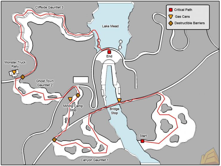
The environments in games are one of the main key elements, it is the world you see and play through, and they have great impact on the gameplay. Not only should the environment be affecting the atmosphere of the game, but it also plays a big part in the gameplay itself. For instance, a large open world which you can explore freely will be the right sort of environment for an RPG or a sandbox style game. On the other hand, a realistic FPS game will have closed in environments, with buildings and streets where you can hide and take cover etc.
Generally, in levels, the designers construct them to lead you through the level. They are built in ways that perhaps are realistic and recognisable, so that you would know where to go, or at least be able to figure out where to go. They have to be built and decorated in some form of logical way, so that you can understand the environment and be able to travel through it and explore.
For the player to believe in the game world, I think there should be a balance between realism and stylisation. Obviously, for the game to be unique and for the world to be unique, it will have to be stylised in some way. But for it to be believable, some realistic qualities will be needed as well.
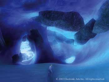
Some games can feel very enclosing. I remember playing SSX3, a snowboarding game. It had really cool and beautiful mountain environments, which you could explore to some extent. And that is where the problem was, I always used to end up going out of bounds, which causes you to reset. I always hated that, thinking that there could be so much more to explore in that direction, yet you have to stick to a certain line down the mountain. Sure, there were shortcuts, and some levels were pretty open, but it never takes long to get to the edge of play. And I think this greatly diminished the freedom aspect of the gameplay. Of course, in races, there has to be limits, but when playing on FREERIDE, you should have more to explore. Even sometimes you can be playing, and right in the middle of a trick, and without knowing that you are anywhere near the boundary, you suddenly respawn.

The environments in Dead Space were very cleverly designed to affect the gameplay experience. There were many people involved in the making of the environment, so I will just list some of the main roles. Yang Cai, Ernesto Guaman, Jian Fie Wang are all environment artists. Jonathan Hackett and Chi Wai Lao were the senior environment artists and Thomas Holt was the environment art lead. Being a futuristic survival horror kind of game, the corridors of the ship were dark and confined. It makes it seem very claustrophobic. The lights in some areas would suddenly turn off, leaving you in darkness for a moment, causing you to head towards any light. But it was not the same confined corridors all the time. There were some contrasting open areas, which were a welcome experience, such as the zero gravity zones and also times when you are out in space itself. This helped to define how big the ship really is, while also making you feel as though you will get lost. I think the designers got a lot of their inspirations from classic sci-fi horror films like Alien, and the sequels. Especially with the way futuristic ships are portrayed. Also, I would imagine that they looked at current space facilities and ships, like at NASA to get their ideas for specific things like control rooms, pipes and tech that is in corridors etc.


No comments:
Post a Comment